If you’ve ever grabbed a product off a shelf at a grocery store, beauty boutique, or tech shop only because its packaging stopped you mid-step, you already know packaging isn’t just a box—it’s your brand’s first conversation with a customer. As a packaging box supplier who’s worked with hundreds of small startups and established brands over the last 12 years, I’ve seen first-hand how bad packaging can sink a great product, and how intentional, customer-focused design can turn a random browser into a loyal buyer. Designing an attractive packaging box isn’t about slapping a cool logo on a cardboard container; it’s about balancing aesthetics, function, and brand story to stand out, protect your product, and make your customer feel something. Below, I’m breaking down the science and strategy I’ve tested with clients time and again, no fancy design degree required. Packaging Box
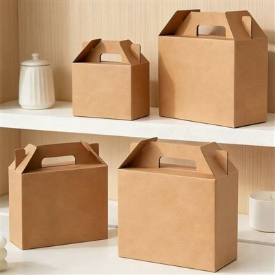
First, let’s get one thing straight: attractive packaging starts before you pick up a design tool. Too many brands come to me with a product and a vague idea of “making it look nice,” only to realize the box is too flimsy, too big, or completely wrong for their target audience. The foundation of good packaging design is audience alignment. Last year, I worked with a small specialty tea brand targeting busy, eco-conscious millennial parents. Their initial box design was a thick, textured cardboard with a gold foil finish and a tight, magnetic lid—pricier, but they wanted it to feel “luxury.” When we tested it with their core audience, the feedback was immediate: parents said the magnetic lid was a pain to open one-handed while juggling a toddler and a sippy cup, and the heavy box felt like unnecessary waste. We pivoted to a lightweight, 100% recycled cardboard mailer with a tear strip for easy opening, and added water-based ink prints of cute, relatable tea bag illustrations (think not “organic tea” but “your 3 PM sanity boost”). Sales of their packaging jumped 28% in three months, and customer reviews specifically mentioned how “easy and nice” the box was. That’s the power of designing for your people, not what you think looks cool.
To nail audience alignment, start with three questions: Who is buying your product? What do they care about? How will they use the box? For a teen-focused skincare brand, bold, neon colors and interactive elements (like scratch-off product facts) will resonate; for a luxury watch brand, minimalist, matte black boxes with subtle embossed logos signal exclusivity without screaming. If your customers order online, add unboxing in your use case: will they be opening it at home on their couch, taking it to a friend’s house as a gift, or rushing to throw it in their work bag? These small details make the difference between a box that gets recycled immediately and one that gets posted to Instagram or repurposed as a small storage bin.
Next, the science of visual hierarchy—this is what makes packaging stop someone in a crowded shelf or a cluttered email inbox. When a customer sees your packaging, they spend 2 to 3 seconds making a split-second decision: do I keep looking? That’s not a lot of time, so every element has to work together to guide their attention. We use a simple rule with all our clients: one primary focal point, one secondary detail, and the rest is supporting. For example, if you sell handmade candles, your focal point shouldn’t be your logo—it should be a high-quality photo of the candle next to a cozy, relatable scene (like a knit blanket and a book) that tells the customer how the product will fit into their life. The logo goes secondary, maybe in a subtle corner or in a slightly smaller size, and key info (scent, burn time, ingredients) is easy to read in a clean, legible font.
Color is the biggest player in visual hierarchy, and it’s rooted in psychology, not just personal preference. Red and orange trigger excitement and urgency, which is why they work for snack brands or limited-time offers; blue signals trust and reliability, perfect for baby products or tech accessories; green equals eco-friendliness, non-negotiable for zero-waste or organic brands. I once had a sustainable cleaning product client who kept coming back with designs in bright red and neon yellow—until I pointed out that their target audience was retired homeowners who wanted reliable, gentle cleaning, not a “get stuff done fast” vibe. Swapping those colors for soft sage and warm beige immediately made their packaging feel like theirs, and their in-store sales lifted because it didn’t clash with the neutral home goods aisle they were in. Pro tip: Test your color scheme in 3 different contexts: on a shelf next to competitors, on a phone screen (since most people browse online first), and in dim light (to make sure text is readable, not washed out).
Once you’ve got the audience and visual basics down, it’s time to add the “attractiveness” factor that makes customers care: personality. Attractive packaging isn’t generic. It tells a story, and it makes the customer feel like they’re getting something unique, not just a box. That doesn’t mean you need custom illustrations or hand-written notes—though those help—but it does mean avoiding the same 3 design templates every brand uses. Let’s take two brands selling chocolate: one uses the same candy pink box with a generic heart, while the other (a family-owned bean-to-bar brand) uses kraft cardboard with hand-stamped cocoa bean designs, a tiny note from the founder about where their cacao is sourced, and a seed paper insert that grows into wildflowers. Which one feels more attractive? The second one, because it has a story. We’ve seen that simple, personal touches can make packaging perceived as 15-20% higher value, even if the production cost is only slightly higher.
But here’s a common mistake brands make: they prioritize personality over function. A box that looks amazing but can’t hold its product, gets crushed in shipping, or is impossible to open is useless. Function isn’t boring—it’s part of the design. At our company, we start every packaging project with a prototype, not a final design, so we can test how the box works. For a fragile product like ceramic mugs, we use die-cut inserts that hold each mug snugly, so when the customer opens the box, there’s no broken product, no bubble wrap mess. For clothing brands, we design boxes that are the right size for their items, so they don’t have to waste space or use extra filler. Function also includes sustainability, which is no longer a nice-to-have for customers—it’s a requirement. A 2023 survey by the Packaging Association found that 60% of consumers will pay 5% more for packaging that is recyclable, compostable, or made from recycled materials. That doesn’t mean every box has to be 100% compostable (though it’s great if it can be), but it does mean being transparent about your materials. Add a small logo on the box that says “100% recycled cardboard” or “Compostable in home conditions”—customers notice that, and it makes your packaging feel more attractive and responsible.
Another underrated element of attractive packaging is consistency. If your brand has a website, social media, or store display, your packaging has to match that same look and feel. You don’t want your packaging to look like a completely different brand when a customer receives it. For example, if your Instagram uses clean, minimalist photos with black and white filters, don’t make your packaging bright neon. We work with a skincare client that has a muted, neutral brand aesthetic across all touchpoints—their website is simple, their social media is soft, and their packaging is matte white with tiny, gold-foil logos. When customers order from them, they know exactly what to expect, and the packaging feels like an extension of their brand, not a afterthought. Consistency builds recognition, and when a customer sees your box in the mailbox or on a shelf, they’ll recognize it immediately and think, “Oh, that’s the brand I like.”
Now, let’s talk about the mistakes I see brands make all the time that make their packaging forgettable. First, overcrowding the box. So many brands stuff every piece of info, every logo, and every promotion onto the front of the box, making it look cluttered and hard to read. Remember that 2 to 3-second window? Don’t waste it with 10 different things the customer doesn’t need to know right away. Save product details for the side or bottom of the box, keep the front clean, and only include what’s most important: your product, your brand name, and one key value. Second, ignoring the unboxing experience. Unboxing is part of the customer journey, especially for e-commerce brands. Small touches like a custom sticker, a thank-you note, or a box that “surprises” when you open it (like a little window that reveals a sample product) can make the unboxing feel special. It doesn’t have to be expensive—our team once designed a box for a small jewelry brand that had a hidden compartment for a free earring back, just enough to make customers feel like they got a little extra. Third, not testing before launching. I can’t tell you how many brands come to me with a final design only to realize it prints wrong, doesn’t fit their product, or looks terrible in person. Always get a physical prototype, test it with 10-15 people in your target audience, and make adjustments before you order in bulk.
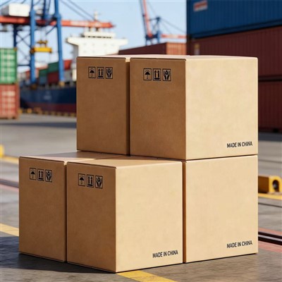
At the end of the day, designing an attractive packaging box is all about balancing three things: what your product needs to protect it, what your customer wants to feel when they interact with it, and what your brand stands for. It’s not about being the flashiest or most expensive—it’s about being intentional. If you’re ready to design packaging that stands out, sells your product, and makes your customers happy, our team has the expertise to help you every step of the way: from concept and prototype to bulk production, tailored to your budget and needs. We work with brands of all sizes, from new startups just launching their first product to established companies looking to refresh their packaging. Contact our team to start a conversation about your packaging goals, and let’s create something that works for your product, your customers, and your brand.
Courier Box References
The Impact of Packaging Design on Consumer Purchase Decisions. Journal of Packaging Technology and Science, 2022.
Consumer Attitudes Toward Sustainable Packaging: A Global Survey. Packaging Association Annual Report, 2023.
Visual Hierarchy in Point-of-Purchase Packaging. Journal of Retailing and Consumer Services, 2021.
Hangzhou Yitian Printed Goods Co., Ltd.
We’re well-known as one of the leading packaging box manufacturers and suppliers in China, also support customized service. Please feel free to buy high quality packaging box made in China here and get pricelist from our factory. For price consultation, contact us.
Address: Room 1719-1, Building 2, Xinglan Building, No. 2333 Xixing Road, Xixing Subdistrict, Binjiang District, Hangzhou City, Zhejiang Province
E-mail: sxyunchao2023@163.com
WebSite: https://www.ytcarton.com/
